Email Marketing Landing Pages: A Guide
Email marketing is a powerful tool in itself, but it's even more so with the use of landing pages. Landing pages are pages you put on your Website that customers can link to from your email. On their face, they allow you to keep your email copy to a minimum as well as funnel customers to a page with more info, more images, and even a purchase option so recipients can buy what you're selling.
Why are landing pages used?
To cut back on your email copy and let you put more links in your emails
To add a more extensive explanation beyond your email copy
To showcase your goods and services
To give your recipients tip lists
To send customers to extensive pages on shipping info and sales
To draw recipients to your Website
To up-sell ancillary products on your site
To help you track your email campaign traffic and how effective your campaigns are
To ease the burden of your customer service team
A landing page is really no different than any other page on a Website, except for the fact that they're meant to be found and “landed on” directly from your emails and newsletters.
Creating and maximizing landing pages: helpful tips
Make the pages in-line with your overall Website design
The key to landing page design is to make it look like the rest of your Website. It should blend in perfectly, so just in case a customer decides to poke around on your other pages, they won't get confused about where they are.
Put a Signup Form on every page
Most likely, the people who visit your email landing pages will link directly from an email you sent to them. But it's quite possible they'll find it some other way, through a page in your email archive, through an email forward from a friend, from a general keyword search for your product. What you want to do is two-fold – get your customers to buy what you're selling, but also sign up new email subscribers as well. Put a Signup Form on every landing page. This way if your landing page visitors do not buy what you're selling, they can at least sign up for your email updates and possibly buy something at a later date.
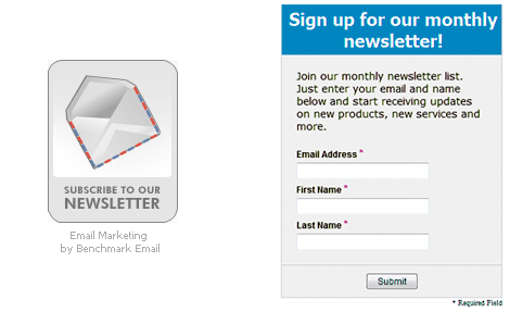
Here's an example of a Benchmark Email sign-up button and a Signup Form:

Benchmark Email's paid plans include custom sign-up boxes to grow your email list. Add you logo and text, choose the colors and place it on your Website. All the unsubscribes that come through your Signup Form are automatically added to your Website.
Include a shopping cart
If you're selling a good or service, your landing page should give your customers some way to buy that good or service or add it to their online shopping cart on the spot. Don't waste this opportunity. Give your landing page visitors a quick and easy way to a purchase.
Don't skimp on graphics
Email service providers regularly block images, making it difficult to showcase what you're offering in your campaigns. However, with your landing pages, the sky's the limit. Add images and graphics, dynamic sales text and more. Make it appealing in design and informative in content.
Make sure your pages link to other pages on your main site
Whatever you do, don't make your landing pages a dead end. Your ultimate goal is to get your customers to check out lots of items you're offering. If you send them to the landing page and don't give them the opportunity to look around, you're cutting off a potential sale. Use links to send your landing page guests to other pages featuring complementary products and services.
Your landing pages should be error free, easy to look at and contain lots of
valuable information. As an added bonus, your landing pages could be indexed by search engines, improving your rank when customers do a keyword search for items you have on your site.
Related Articles
