Email Marketing Layouts: 5 Solid Tips For Success
If you're doing any email marketing at all, know this: your layout is just as important as your subject line and content. A muddled or crammed layout will turn your recipients off and confuse them, while a layout with overly bright colors or too much white space will bore them into not buying what you're selling.
But take heart. There are some good guidelines to follow when producing your layouts. Keep reading for valuable tips in making your layouts the best they can possibly be.
Keep your graphics in check
It's certainly tempting to use a lot of good, eye-popping graphics in your layouts. However, there is such a thing as having too many graphics. Think about the amount of time each customer spends reading an email – recent studies show that customers tend to skim each email and spend an average of seven seconds on each one. If you've overloaded your email layout with graphics, that seven seconds will be spent trying to process all that data. And at worst, recipients will miss your message or call to action altogether.
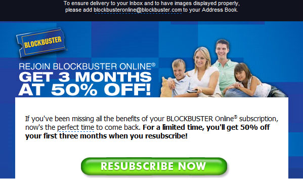
Example: Note how this email uses only a few graphics and plenty of white space to make an outstanding, easy to read format.

Be disciplined about images
This is a variation on the first point, but here's where things separate. Unlike graphics, email service providers will often block images altogether, leaving the recipient with the option of pressing a button so they can actually see them in the message. When you overload your layout with images, it may take longer to load, and once again that seven seconds is wasted when the customer has to wait to see which pictures are in your email. Be disciplined and put no more than four images in your layout, tops.
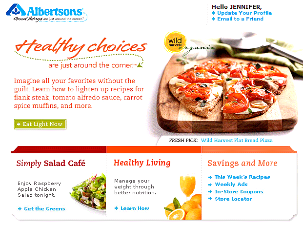
Example: This is an email about food, but Albertsons only chooses a few solid images to get its point across.

Use links to improve your email marketing reputation
Unlike spammers, who might send a thousand emails and never have more than one or two links in their total emails ever even clicked on, good email marketers can use links to solidify their online reputation. Links are good because when you have an opt-in list and your customer clicks on them, it shows email service providers that your recipients are interested in what you have to say and that you're not sending out spam. Put as many as seven links in your email if you want to keep building on your online reputation.
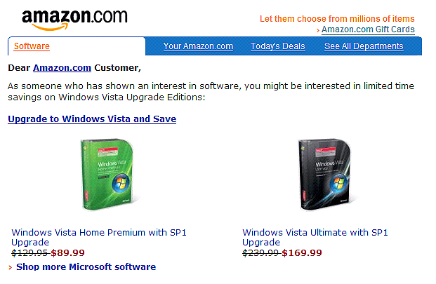
Example: With links in blue including ones that lead to other deals, the individual's account as well as highlighted products, Amazon uses links to show email service providers that each layout is going to someone who is not only a subscriber, but someone who has an account with the company.

Don't bore your customers with too much copy
Most emails need some sort of copy in their layout, but remember that in this age of short-attention-span Web browsing, less is certainly more. Avoid long paragraphs and long-winded explanations. Instead, take your copy and tease with the first few sentences, and then use a link to send recipients back to a landing page on your site where they can get more info and purchase your product or service.
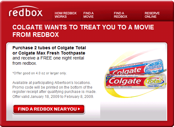
Example: Note how Redbox uses only a few sentences as text, relying on a link back to the company's site to a more expanded page. When it comes to email marketing copy, less is more.

Send test emails to make sure everything is perfect
Most email marketers fail on the testing front, probably because they're under the gun to finish their emails and put them out there to recipients. However, once you create your email layout, we recommend you take the time to send some test emails. Create email accounts with major service providers like Gmail, Yahoo!, MSN and AOL. Send your layout to these email addresses, open it up and make sure everything looks dandy. Remember that emails may look different depending on the email service provider. However, if you take the time to test, you can fix any obvious errors and get a sense of what the customer will see when your email finally arrives.
Your email marketing layout is by no means the only thing to think about when crafting your campaigns, but remember that it is important. If your subject line can get customers to open your email, don't squander the opportunity. Use these tips to increase your clicks on links, sales and more.
Related Articles
